![]() “Delayed on a train? Report it.”
“Delayed on a train? Report it.”
The Delay Tracker app empowers intercity rail passengers in the U.S. to report a train delay with their iPhone to the Surface Transportation Board. The purpose of this app is to identify bottlenecks in our national rail system, educate rail passengers on the likely causes of delays, and create data that can persuade policy-makers to fund infrastructure improvements that will prevent these unnecessary delays.
Executive Producer, Interaction Designer + Product Manager at
Blur Rail, Inc. for DelayTrackerUSA.com

The Delay Tracker brand and UX design was recently refreshed for the #RefreshMyRide campaign. I re-envisioned the experience as a simplified outlet for passenger frustration with their train travel experience.
Orange represents the color of increasing anger and frustration. Imagine your blood pressure rising from a calm yellow to a furious red. In road traffic signaling, any small child knows that red means stop, green means go, and yellow means slow down. Orange represents an alert, or a cautionary construction symbol usually.
These icons are inspired by Google’s Material Design vocabulary, but are unique and proprietary to Blur Rail, Inc.

experience map

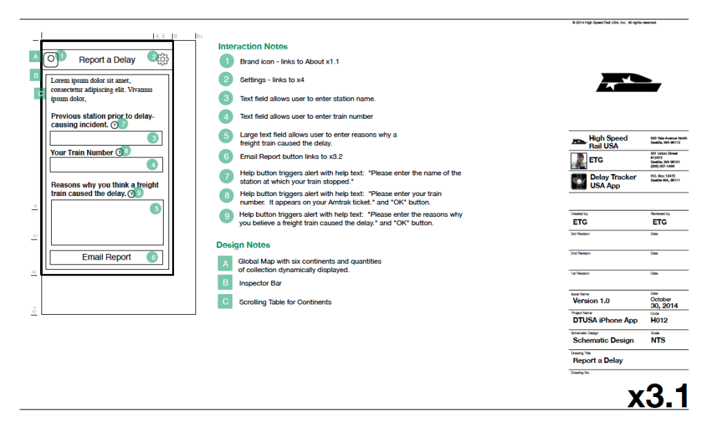
“Report” wireframe
“Report a delay” screen comp

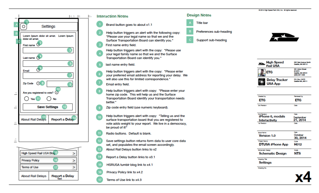
“Settings” wireframe
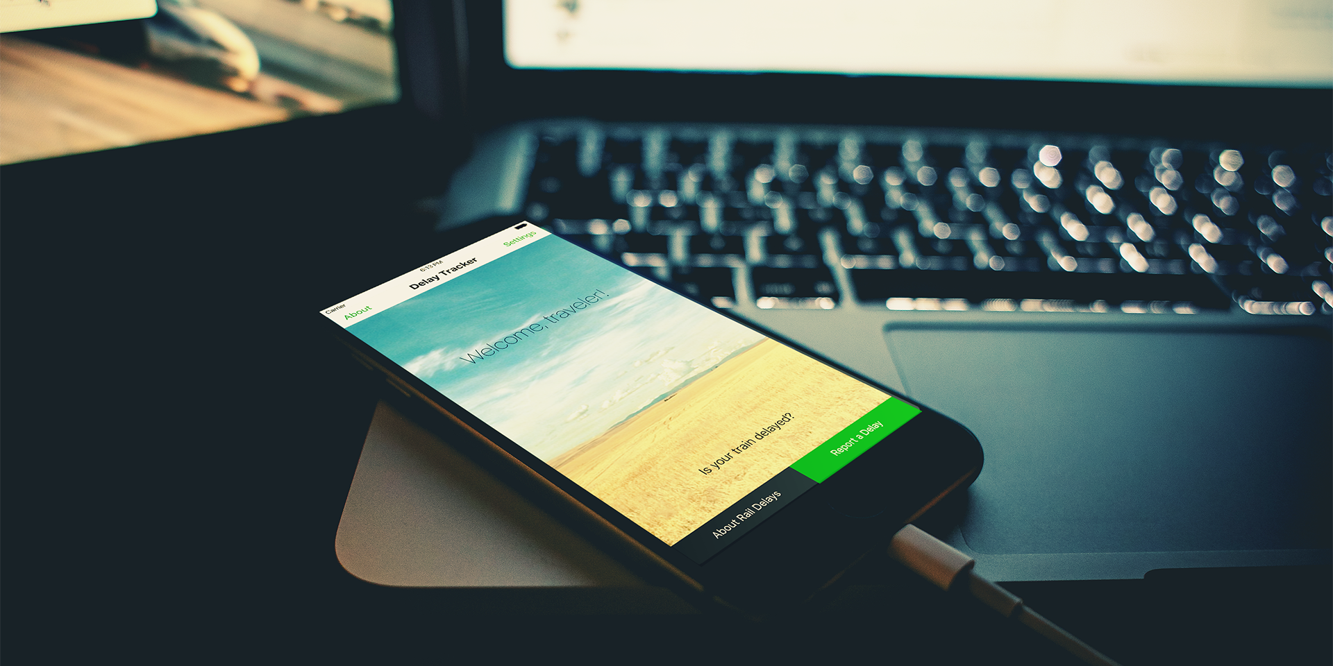
“Welcome” screen comp
“About” screen comp

